Jump 25 All Time Top Sequences – Joint 3rd Place
The titles we created for Absolutely Fabulous came joint third in our competition to find your all-time favourite sequences designed by Jump.
Ab Fab is one of the most popular British comedies of all-time. It stars Jennifer Saunders as the PR agent Edina Monsoon, and Joanna Lumley as the magazine fashion director Patsy Stone. It was a Saunders and French Production for BBC Television. The first series went out in 1992 and the original concept was based on a French and Saunders sketch.
The show always had bold, striking titles sequences that featured bright coloured typography. One of the first series titles were designed by Bernard Heyes and were inspired by a conversation he had with Jennifer Saunders about the Robert Indiana pop art piece ‘LOVE’.
This latest Jump version of the Ab Fab titles, as voted for in the Jump 25 competition, was used for three special 20th anniversary shows that came out in 2011 and 2012.
Jump’s relationship with the series went back a lot further than this though.
The previous version of this sequence was designed by Jump for series 5, which came out in 2003. It had a completely different colour scheme, was created in standard definition (1024×576) and featured different typography in the end caption.
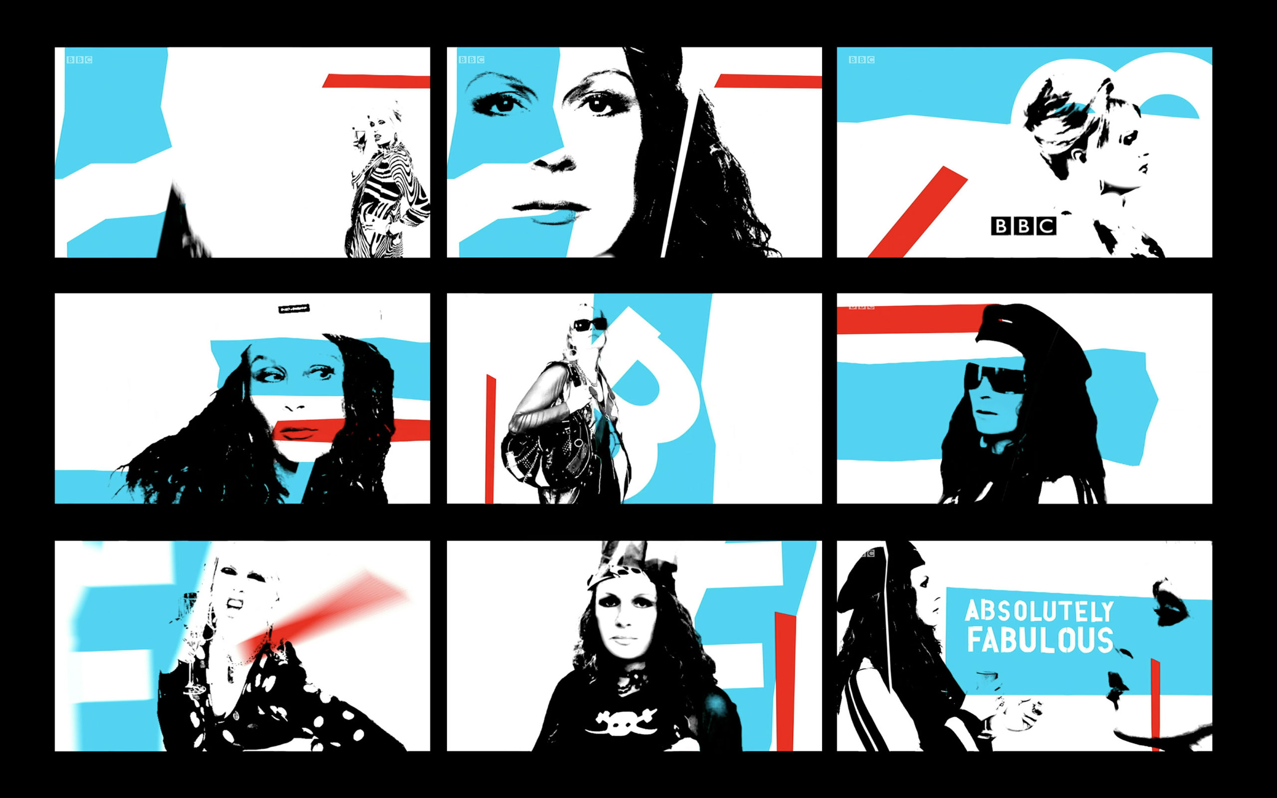
Jump had created an even earlier version of the title sequence for series 4 in 2001. This was made out of graffiti artwork painted by the iconic British fashion designer Betty Jackson, who also designed the outfits for the entire series.

Keith Livingstone, Senior Designer for Jump at the time talks about the design process behind the most recent sequence:
“I remember the brief asked that the titles for this series of Ab Fab were to feature Jennifer Saunders and Joanna Lumley. However as they weren’t available for a shoot we could only use existing publicity stills. Initially this felt like it could severely restrict what we could do with the sequence.
Having been allowed to see some production photos of the set, I remembered that a Che Guevara poster featured on one of the walls of Edina’s lounge. This sparked an idea for a screen-printed approach to the treatment of the cast images.
Coincidentally, at the same time Madonna had just released her American Life album and I was really struck by the graphic treatment on the album artwork – which also wasn’t a million miles away from the poster-style idea that was floating around in my mind.
Jennifer Saunders’ character was always determinedly trying to ride the wave of whatever was current in popular culture, so I thought the link to Madonna tied in nicely. I fleshed out the sequence into a storyboard and treatment, which we presented and won the pitch
Russell Mann gallantly stepped up to animate the title sequence, having to come back off a holiday. I do remember having some interesting discussions with Russy asking to make the moves quicker and quicker!
I think the sequence stands up to the test of time very well (especially with Laura Perrett’s refresh a few years later) and is a great testament of what can be created with very little in the way of assets. It’s a sequence I’m very proud of and nice to hear it’s still loved by others too!”
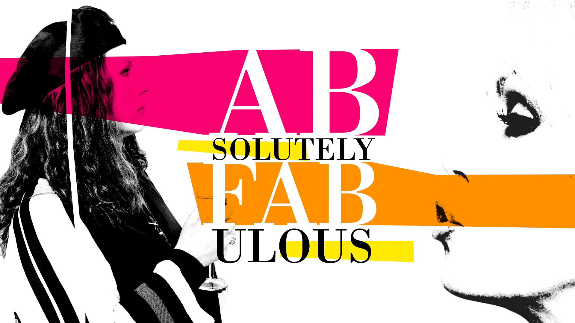
One of the challenges with the most recent version of the titles was getting it to look good at the required higher resolution. It needed to be re-worked from SD to HD.
Laura Perrett, Animator at Jump at the time describes the re-edit:
“There’s no magical HD button to help classic title sequences keep up with modern resolutions, so I worked with designer Keith to recreate and re-animate every element from scratch. This ensured the essence of the original Ab Fab titles was not lost, but gave us an opportunity to add a bit of signature Jump shine and polish!”
Absolutely Fabulous was a Saunders and French Production for BBC Television.