Martin Lambie-Nairn, 1945-2020
Martin Lambie-Nairn passed away on December 25th 2020.
We offer our condolences and sympathies to Martin’s family, all of those at ML-N and to everyone that had the pleasure of working with him.
You can find a book of condolence on ML-N’s website.
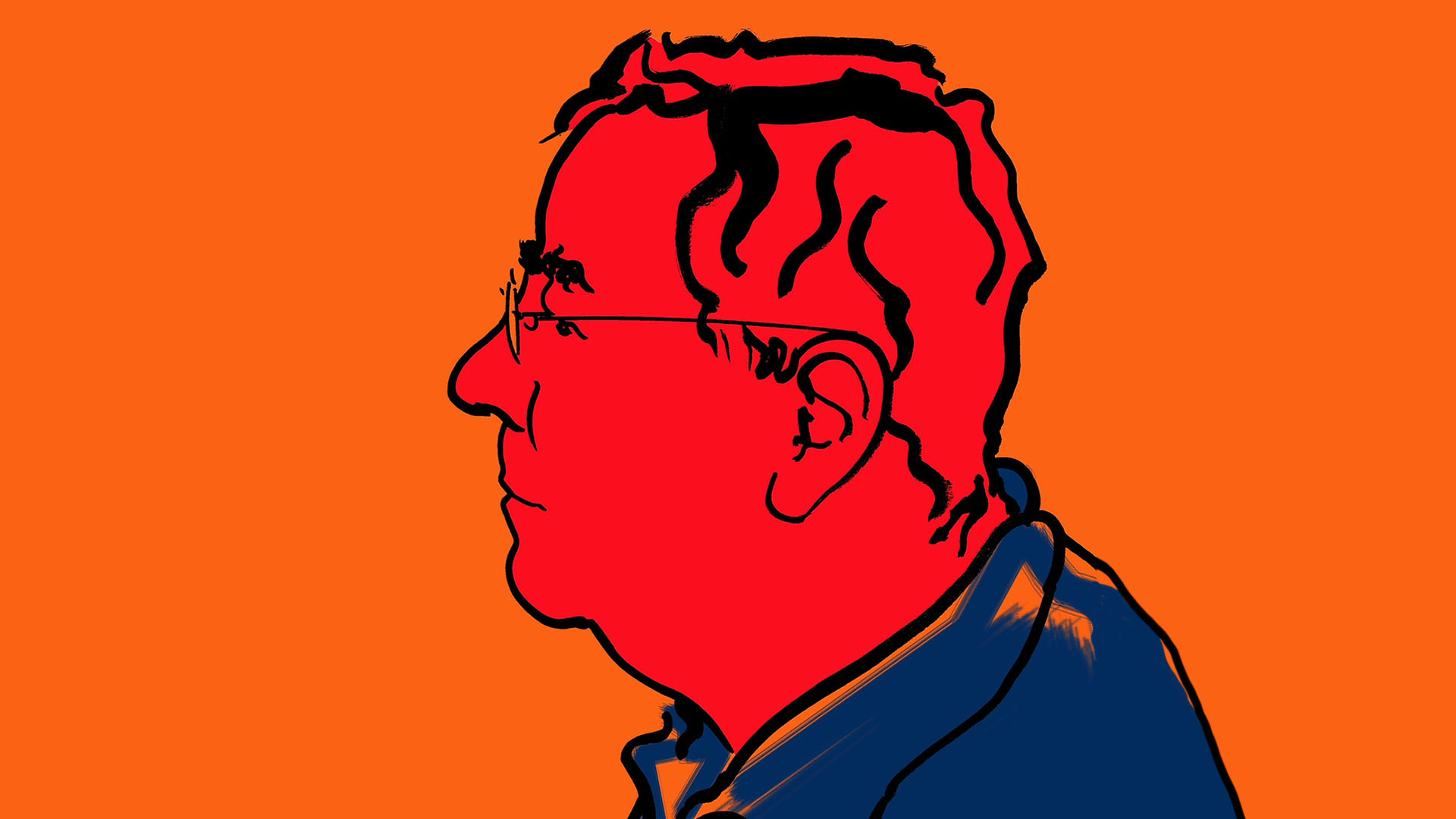
The beautiful illustration above is by Brian Grimwood.
Russell Hilliard – Director, Jump.
It could be possible that you’re a graphic designer and have not heard of Martin Lambie-Nairn, but I highly doubt that. And even if you’re not a designer and are unfamiliar with the hyphenated surname, branding guru, then you will know his work. His contribution to the world of TV design is immense and it was therefore hugely saddening to hear of his death at the age of 75 on Christmas Day 2020.
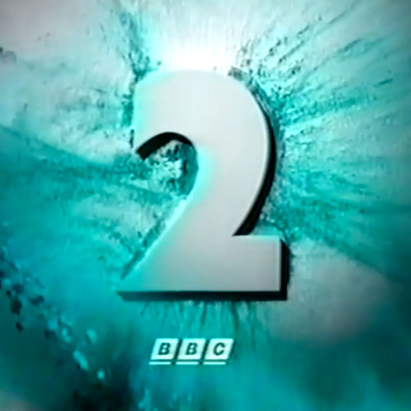
Many years ago, if I told people I worked in TV and we designed and produced title sequences they would ask “Is that like the ‘2’ animations on the BBC?’ (Or they would ask “Is that when people’s names come up at the end of a show?”… sigh ). The point being Martin Lambie-Nairn created graphics that everyone remembered – and graphics that made you remember TV channels.
For one comedy project in the mid 90s we were even asked to parody his BBC2 idents. You can see our efforts on Talkback Productions ‘Smith & Jones’ titles. It’s still one of our favourite sequences – even if it did piggyback off the orginal’s creative genius.
For those that don’t know, the Jump directors all used to work at ITN. For 5 years before we set up this company, we ran the commercial design department at ITN known as IDF. Jump directors Richard Norley and Russell Mann both previously worked on flagship shows within the news organisation. It was during the IDF years that ITN underwent a rebrand and Lambie-Nairn were brought in to complete the project. Richard was even seconded to Lambie-Nairn for a few weeks to give them some assistance. I thought it would be fitting to invite some of the Jump team and our old friends and colleagues from ITN to write up some memories and stories from those times so we could offer our own small tribute to Martin.
Richard Norley – Head Creative Jump, previously Head of IDF at ITN and Head of C4 News Graphics at ITN.
Looking back on the work produced by Martin Lambie-Nairn I strongly believe that he was a visionary and the forerunner of the design approach we now call ‘Digital First’. Well before the internet and social media had even been invented, all of Martin’s TV design work or channel brands were unfussy, clean, stripped back, simple and elegant.
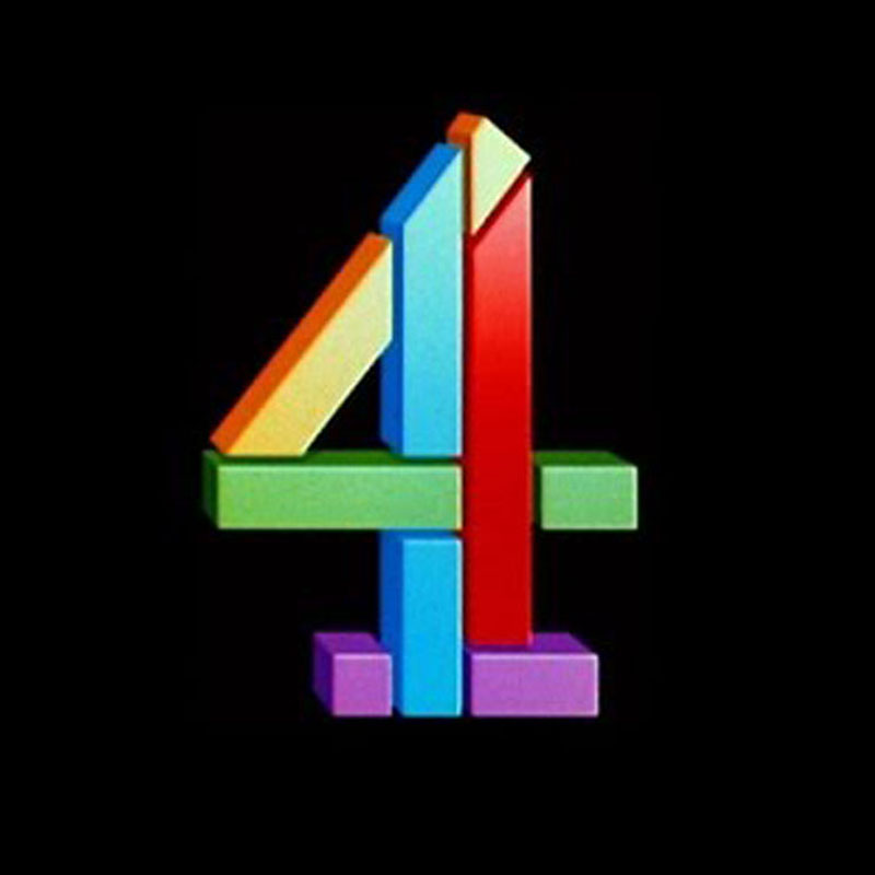
During the time he was producing his finest work, Martin would strip out any unnecessary detail, especially the 3D, texturing and lighting effects, which were all very much in vogue at the time. He of course first made a name for himself for using the ‘latest computer’ technology in the 80’s to create the 3D breaking up and reforming CH4 ident. His subsequent work focused on a design rationalé as much as visual execution. He brought an elegant print designer’s sensibility, and an emphasis on concept to the clutter and noise of bombastic TV design.
But that was just one aspect of his genius – the other and perhaps more importantly was that he brought purpose to his work specifically and by others that followed his lead, to TV design in general. Martin’s concepts were always measurable against what the channel / programme’s tone of voice and ambition was, what they set out to achieve in terms of their brand message, their vision and mission. It’s a common approach nowadays but at the time this approach was unique and it was Martin who led the way in this. Often he would ‘go above’ the heads of the people who commissioned him to speak to the CEO directly in order to get an unfiltered clear understanding of what the design he’d been asked to create should achieve. Long before TV design was about these things Martin brought a marketing and marketers attitude to his work. Taking it above solutions that just looked nice but images that actually carried meaning and the brand’s voice and message.
On a personal note, I was lucky enough to work very closely with Martin during my time at ITN when he was commissioned to rebrand ITN and create an opening sequence for ITV’s News At Ten in the ’90’s.
Before I first met Martin I knew of him through his reputation and achievements, chiefly the magnificent and ground-breaking set of idents for BBC 2. And with it being the 90’s I had visions of Martin being an aloof, power-dressed, be-suited, remote demi-god. But, when I did actually meet him, he was warm and casual, usually dressed in old jeans and an even older leather jacket. He was friendly, softly-spoken and charming. Delightfully, we shared a similar sense of humour and over the months we worked together we would spend many a taxi journey to and from presentations in fits of laughter as we perfected our Terry Thomas “absolute shower” impersonation. We were like giggling school children.
I only worked with Martin for a very short time, but even before I met him, and certainly afterwards he left an everlasting impression on me and my work.
Lesley Everett – Chair of ITN Pension Fund, previously Director of Operations ITN.
I was stunned by the news of Martin’s passing on Christmas Day. I had known Martin since the early 90s. Nearly thirty years of knowing this brilliant man. First impression: warm, small, witty, clever, impressive, lovely. Last time we saw each other, we met for lunch in the autumn of 2019 at a French restaurant to chat about any help I could give a contact. Because that’s what he did, he encouraged young talent – always. We drank French wine and we laughed.
ITN was in a mess in the early 1990s with its brand. Every time the ITN logo appeared on screen it was different on each programme and on every bit of print, camera sticker and sign. It was a crucial time to clean it all up and bring coherence to a company with many outlets, personalities and ambition. It wasn’t all about a logo, of course (though with it appearing in blue and gold, pink and grey, yellow, with bevels, without bevels it needed some work, for sure). It was about taking a company that had ambition and examining its brand properly for the first time. This is where Martin came in.
Martin always insisted on working with the top person – then David Gordon, CEO and Nigel Dacre, then Editor of ‘ITN News on ITV’. He always insisted on bringing the in-house graphics team with him as well. He knew it wouldn’t work without that. He had no airs. Martin was always in jeans, usually a bomber jacket with his battered brown, leather shoulder bag. He chose brilliant teams – great typographers (rare then in TV), great producers, account managers, creative directors. He led them all by example.
The logo was re-drawn very closely back to what it had been when Martin himself had drawn it whilst working at ITN in the 1970s. He took away the bevels, the drop shadows and said it should always be white (reversed out) or blue (Pantone 285C for those interested). And he asked why did all of ITN’s programmes on ITV have different title sequences, styles and logos? It was an opportunity (before ITN’s clients wanted programmes under their own brands later on) to shout ‘one ITN’ across all outlets on ITV where the biggest audiences were. And why did we hide Big Ben on News at Ten? It’s ITN’s most important ‘brand property’ – he told us what we should have known. Martin always said that dealing with journalists and Editors was always the most challenging of relationships. Even more so than CEOs and Chairs! I think it was because he had worked for ITN, then at LWT for Weekend World and other programmes that he knew how to manage these relationships.
Impressed with Lambie-Nairn we appointed them again to help on the relaunch of EuroNews which ITN took over the management of in 1997. The new brand used the same ITN blue and font and although the look was more ‘european’ you knew it was run by ITN. At the celebration dinner hosted by Stewart Purvis, Martin was quick to point out that the wine list had not been requested and quickly rectified the situation.
ITN had ambitions to launch their own 24-hour news channel with outputs on radio and online. There was no other company to help brand this new channel in our minds, so Lambie-Nairn were brought in. The ‘arrow’ idents with the strong, simple ITN logo made for a powerful launch in August 2000, and put ITN front and centre of UK news brands. Martin had sold his company to WPP in 1999 but many of his team remained and his spirit and ethos live on.
ITV took over the channel in 2004 and both ITV and Channel Four asked for their programmes to be branded separately. ITN became a business-to-business brand overnight. But the heritage of the brand, the programmes for over 50 years (at that time) could not entirely eliminate it. What Martin and Lambie-Nairn did was to strengthen and simplify ITN’s brand at a crucial time just before it was diminished on screen. Martin always said it would never disappear, just evolve. Martin will mainly be remembered for his BBC and Channel Four work, but his relationship with ITN over so many years had a huge impact for the company.
‘It’s not all about a logo’.
What an influence on so many; without doubt my biggest influence during my time in design and branding. Most of all, I won’t forget that beaming smile and warm hug. Shine bright up there, Martin.
Glenn Marshall – Digital Brand Awareness User Experience Multi-platform Executive Content Global Imagineer and Thinkfluencer, previously Creative Director ITN.
@marshallcartoon
I worked with Martin on one of the ITN News rebrands. I was a bit in awe of the TV design legend, but he was very down to earth and friendly. No pretensions at all. I learned a lot in those few months….sadly forgot a lot of it too! His attention to detail was incredible. I spent about two hours with him just designing one over-the-shoulder generic to use for CRIME stories.
As a personal aside at the outset of the project the revamp team from ITN went to a brand meeting at Martin’s company office. We realised everyone at their company seemed to be called Creative Director…even the cat! So mid meeting the Editor of ITV News (Nigel Dacre) introduced me as ITN’s Creative Director. (Up until that moment I was a mere Design Supervisor.) The next day a notice went up at ITN that I was now their Creative Director. No role change or salary hike just a shiny new title. So indirectly Martin got me a big promotion.
Another thing of note is that WAY back Martin was a staff designer at ITN.
Having written briefly for Spitting Image I’m also indebted to Martin as co-creator along with caricaturists and sculptors Peter Fluck & Roger Law. The show credits read “based on an original lunch with Martin Lambie-Nairn”
Kojo Boateng Creative Director at PBS NewsHour, previously Creative Director at ITV News.
kojoboateng.com / @kboateng
Martin’s contribution to the world of design and branding was pivotal to how we see branding today. He opened up a world of ideas that were emotional, experiential and at times irreverent. He also took full advantage of emerging technologies to express his creative design ideas.
I remember in 1990, when I was a student at Croydon College, the designer Daniel Barber (who worked with Martin on the BBC News idents) came to give a talk. He walked us through the process of creating the animations for the opening titles (remember the electricity bolt designs?). I recall being fascinated by the design process and wondering what technology they used to create it. That specific presentation was eye-opening for me because it showed what was possible beyond print design. It was a real light bulb moment.
I sadly never got to work with Martin, but as Creative Director at ITV News from 2007 to 2014, I was fortunate to work with the design team at Lambie Nairn on the current ITV News identity. What was clear to me then was that his process of aligning the personality of a company with thoughtful execution of design was also present amongst his team.
I remember being introduced to him once at a party by my boss at the time, Lesley Everett, and just being awestruck. I remember him being charming and humble with a look like he was always on the verge of saying something funny. It was really cool to finally meet a design hero.
My favourite piece of his work has to be the original Channel 4 identity. (In particular because at the time I was so excited that the UK was having a fourth channel). The design was so distinctly different for that era – those floating objects forming to make the number 4. Over the years, other designers have taken the original concept, remixed and deconstructed it. But at its core, even in 2021, the mark is still the same. What also impresses me is that the intent behind the design – to capture the values and mission of the company – are very clear in Martin’s ideas. He has passed the baton to generations of creatives to be just as bold and thoughtful with their ideas.
More tributes that are well worth a read:
https://www.designweek.co.uk/issues/4-10-january-2021/martin-lambie-nairn/
https://www.theguardian.com/global/2020/dec/31/martin-lambie-nairn-obituary
https://www.creativereview.co.uk/martin-lambie-nairn-tv-branding/