Sport Industry Group Rebrand 2022
Jump is proud to be a partner of the Sport Industry Group and official supplier of graphics to the Sport Industry Awards.
We were recently asked to help give them a brand refresh. They are well-known in the industry by the acronym SIG and they wanted a new logo that reflected that familiarity. They wanted the new design to be simple, modern, more approachable and feel less business-like.
Callum O’Reilly – Senior Designer at Jump:
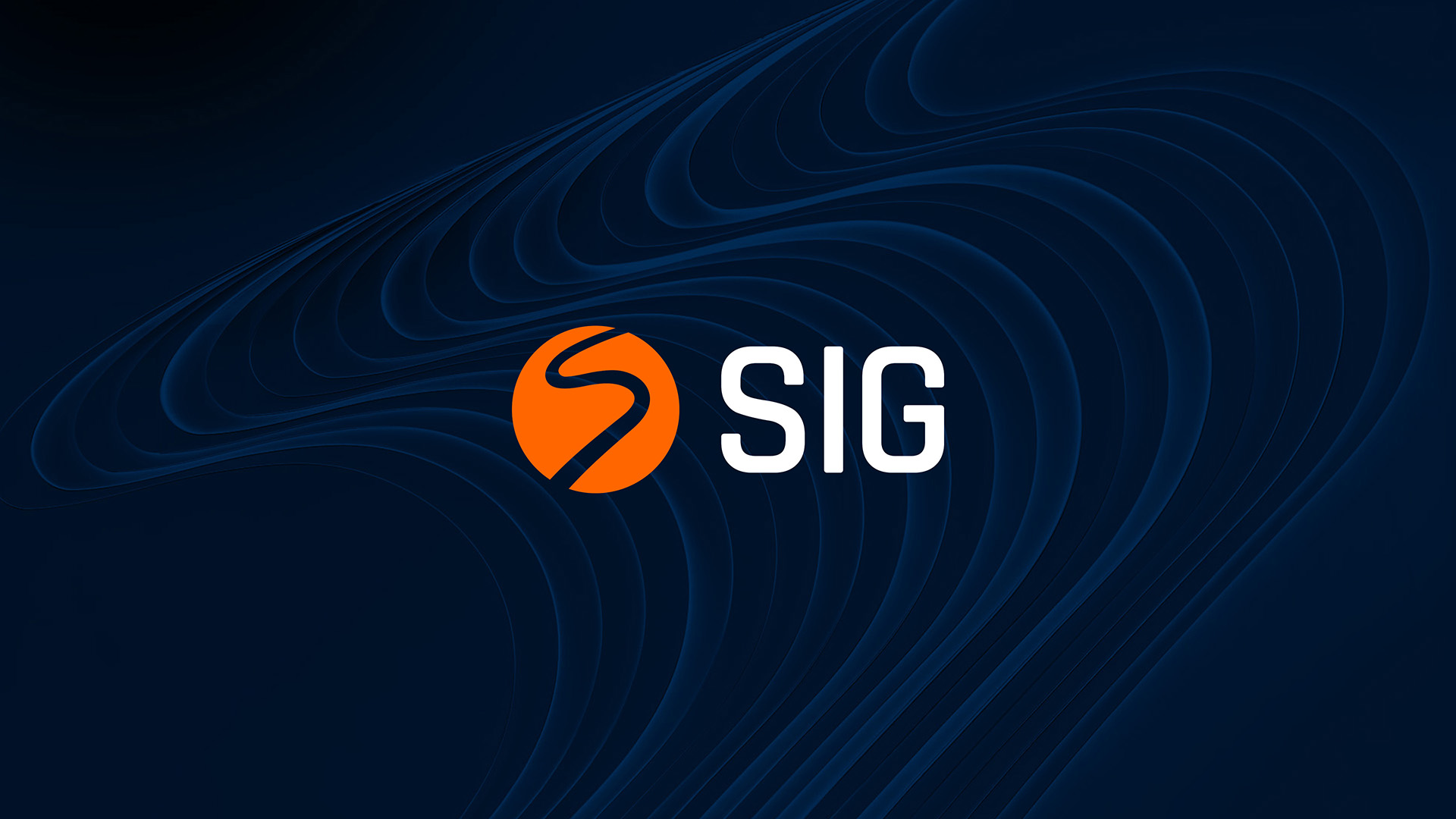
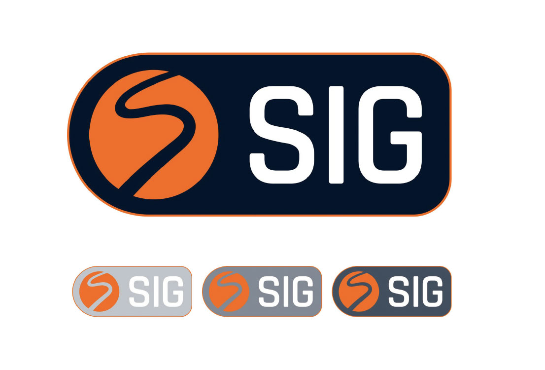
“The S ’roundel’ shape is iconic to the original brand. We didn’t want to change it much but decided to give it a refresh by tightening up the curves and simplifying it.
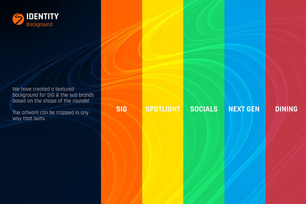
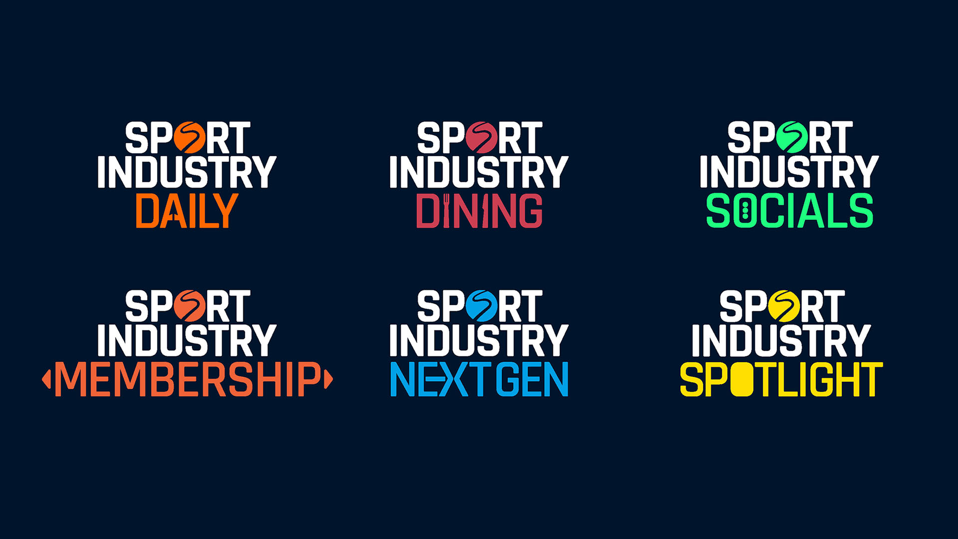
As well as the master SIG logo, we were also tasked with creating a coherent look for the rest of their sub-brands, such as Sport Industry Spotlight and Sport Industry Next Gen. Each logo has its own unique colour and typographic quirk that symbolises what that brand is all about.
For example:
Sport Industry Socials includes three dots in the ‘O’ which are synonymous for digital chat, whereas for Sport Industry Dining we included a knife and fork.
Sport Industry NextGen (an academy programme), incorporates a subtle arrow symbolising the push and drive they give individuals to start in the sport industry.
Sport Industry Daily (a daily email update), incorporates a computer arrow in the A.
Lastly, Sport Industry Spotlight simply has a filled-in O to represent a spotlight.
The roundel is featured in the word SPORT within all of the logos, as a definitive mark from the umbrella SIG brand.”
The deliverables for the complete rebrand project included:
SIG and SIG sub-brand logos for all uses (Web, digital, print).
Roundel redesign in SIG and sub-brand colouring.
A suggested brand font for use in digital and print.
A style guide for how to use the brand logos.
A PowerPoint template allowing SIG to create new decks with a coherent consistent brand.
A set of templates for social media, emails & banners.
COR – “We believe the new design is approachable and has brought SIG into the digital age. The simplified roundel mark has really helped with that, along with bold colours and a digital-first approach to design.”